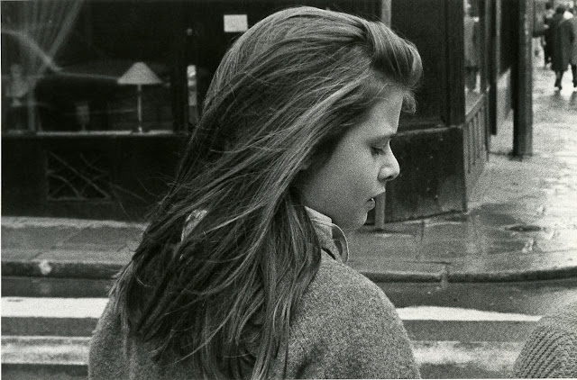
When I first undertook photography my perception was that most serious artists and aspiring artists used black and white film in their cameras and, by extension, in their seeing. And, to my mind, there's a giant chasm between seeing in color and seeing in black and white. When we look with a black and white or monochrome sensibility we tend to looks for graphic shapes and forms that are recognizable and not too finally detailed. We look to recognizable forms that tell stories or describe objects.
But in color we tend to look for pleasing chromatic combinations or pretty pastels that can nestle next to one another in a pleasing and hue driven pattern. Or the antithesis, a garish pattern comprised and composed of striking opposite colors which usually sit, glaring at each other from the opposite side of the color wheel. Knowing what our final destination will generally be we select subjects and scenarios that aid our artifice. If we know we're diving into the pool of color then the juxtapositions of colors becomes (consciously or unconsciously) our target and goal. Conversely, when we know we'll be making images in monotone we look for content to carry the visual narrative and tickle the part of the brain that wants to know the story.
You can see this in image after image on the web. And I'm not making a value judgement either way other than to say that I think B&W is being marginalized into a photojournalistic ghetto of photographic art and I'm hoping that, like the phases of the moon, that images about things and forms and textures come back into our perception of the orbit of art and start to re-assume precedence over the titillations of candy color.
Soothing but empty.
A story I want to hear.....


No comments:
Post a Comment